mirror of
https://github.com/go-gitea/gitea.git
synced 2024-11-25 08:11:19 +01:00
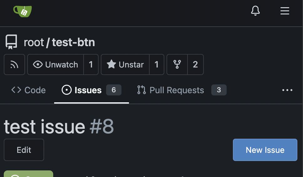
I guess there could be enough people liking to make the Settings menu item right aligned. As a site admin, I found it's easier to find the right-aligned Settings menu item. Tested with various sizes:    |
||
|---|---|---|
| .. | ||
| components | ||
| features | ||
| markup | ||
| modules | ||
| render | ||
| standalone | ||
| utils | ||
| vendor | ||
| webcomponents | ||
| bootstrap.js | ||
| bootstrap.test.js | ||
| htmx.js | ||
| index.js | ||
| jquery.js | ||
| svg.js | ||
| svg.test.js | ||
| utils.js | ||
| utils.test.js | ||
| vitest.setup.js | ||